Cleaning up the Edges: A Visual Evolution
After having already worked for the Rock & Roll Hall of Fame for over a decade, the owners of Berea Moving & Storage Co. decided to officially incorporate their art handling division, ten years ago. As an homage to their parents, the sister and brother duo, Lisa and Woody, decided to utilize the name their parents created for their boat, WOOD-LEE. WOOD-LEE, is simply a clever combination of WOOD for Woody and LEE for Lisa. Upon the incorporation of an official company, they unveiled a logo that was thoughtfully developed containing three bright, bold paint splotches to represent the creative nature of their company.
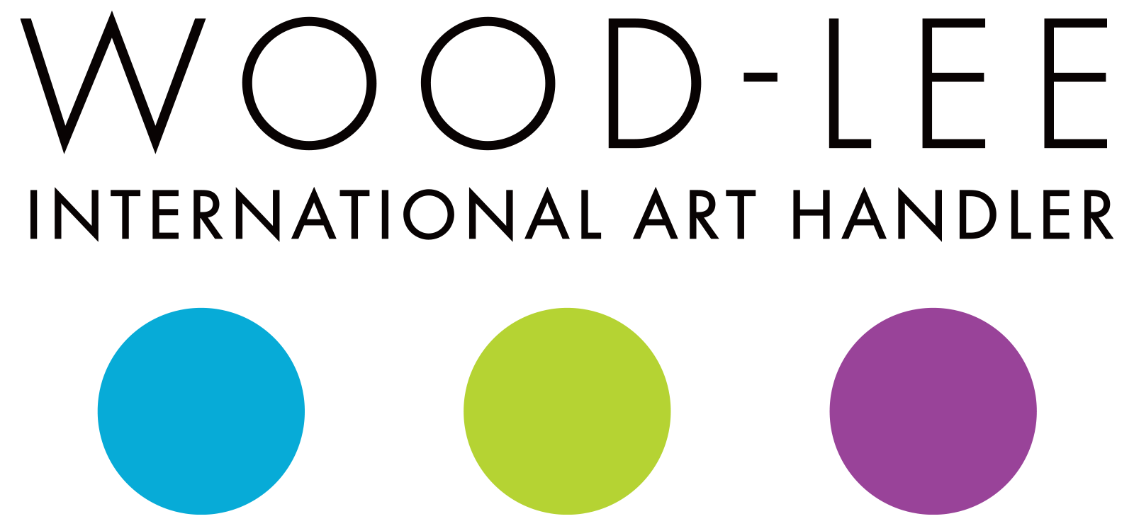
But, as a company matures, grows, and changes for the better, so should their logo and visual identity. The evolution of WOOD-LEE’s logo utilizes the same colors and typeface, but polishes up those paint splatters to even, symmetrical circles. This change serves to represent the more sophisticated nature of WOOD-LEE’s work, while the colors still portray the fun and artistic aspects of their work.
This evolution from the previous logo, better represents WOOD-LEE’s white-glove approach and attitude to art handling. Clarifying the message is key, to ensure that there is never an implication that their work may be messy like a splatter, rather it is absolutely clean, steady, and precise as the three equal circles now represent.
